The Monstrologist
The Monstrologist is a joint project I worked on as a UX designer along with Dana Platpire (head artist, producer and project manager), Dana Ivanova (assistant illustrator and writer) and Nerissa Ruohui Wang (composer). The project was developed remotely and its creators were scattered throughout Poland, Russia and Great Britain.
Duration: 2 months
Methods: secondary research, competitor analysis, feature roadmap,IA, wireframes, prototyping, IDI’s
Tools: Zoom, Marvel, Basecamp, Adobe XD, Wireframes CC, Draw.Io
Year: 2020
Context
There is a visible increase in the number of diagnosed young people with mental health problems. Several factors are believed to contribute, such as the increased school pressure, the effects of social media, as well as the ever fluctuating world, with circumstances such as the currently on-going pandemic resulting in a lot of stress for the current generation.
However, those increasing numbers are also the stems of the fact that young people are much more aware of the importance of mental wellbeing than their predecessors, and therefore, are more likely to take the decision to be diagnosed.
The Monstrologist is a text-based edutainment mobile game which aims to educate young people about mental health through examples set within a number of fictional characters and narratives, as well as to monitor their own well-being.
The Process
Defining Project (problem statement, project vision, project KPIs, project goals)
Research (secondary research, competitor analysis, feature roadmap)
Understanding Users (personas, empathy maps)
Ideation (Information Architecture, paper sketches)
Wireframing (wireframes, prototyping)
User Testing (usability testing plan, testing observation document, corrections based on feedback)
Style Guide (color palette, typography, elements)
Visual Design (Mobile UI)
Research
Our team worked according to the work system called Dynamic System Development Method (DSDM). Before jumping into an actual design I spent time on a detailed research that consisted of: defining problem statements and project KPIs, analyzing the competition, feature roadmap, creating user personas and empathy maps.
Competitive research: I examined apps available on the market from the mental health category. All of them were recommended by the NHS England official website. You can read my detailed presentation here. In conclusion, none of the apps currently available on the market are developed specifically for Generation Z. It is very important that the mental health app is developed in collaboration with a specialist and that it is accredited by the NHS or other reputable health organisation.
User stories: Created user stories helped us to understand users with different backgrounds and perspectives, including: the user's parent, a user familiar with the type of gameplay based on text stories and a user not familiar with it yet
Examples of personas:


Define
Core features:
text based gameplay - gameplay style popular for games from Japan, it is a comic book style of a gameplay where users follow the story of the main characters and make choices that guide the game from among the given options.Users follow a story of a young boy living in England who struggles with mental health issues, they have control over his choices regarding handling these types of problems.
mini games - to maintain user involvement, they are given the opportunity to play additional mini games within the application. To prevent users from spending too much time on the phone, mini games have a time limit and are only available for purchase with coins collected in the game.
help services - a page where users can browse through all mental health helplines and organisations available in their country
rewards and points - users collect points in the main gameplay as well as mini games and with them they can buy new backgrounds, avatars and access to mini games.
Ideation
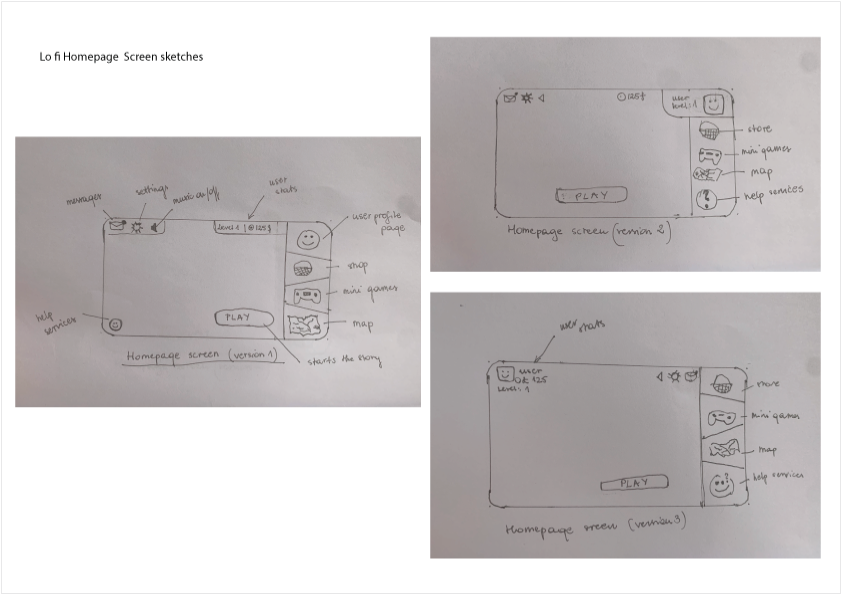
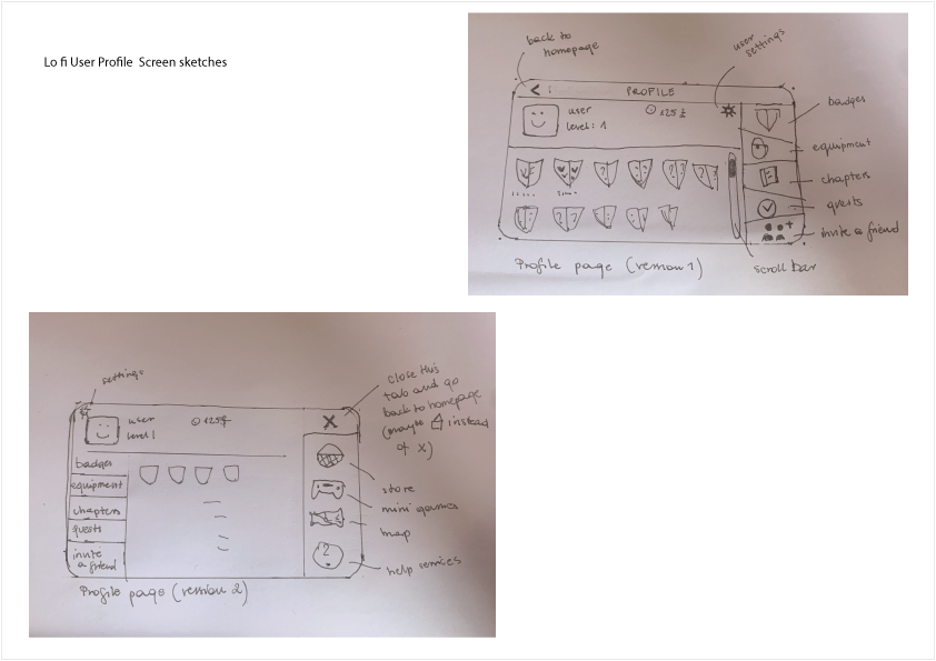
Low fidelity wireframes:
Low fidelity wireframes once created where put into a prototype and used for user testing via Zoom. I conducted 5 test sessions with users aged 11-20 years. I created a prototype using Marvel, because it was the most convenient platform that allowed me to share my prototype with others via a link on both computer and phone. Young testers shared their screen with me and I could see how they were following the prototype performing their assigned tasks. At the end they also gave me general feedback. Based on these usability tests the final project was proposed. View tests findings here.


Design Guide
Design guide was prepared by the head artist, I followed instructions given.
Final Product
Retrospective
Challenges: This form of gameplay and the culture associated with it was not known to me before. I had to do a lot of research to understand this market, its users and their trends because they were very unique and different. The new challenge was to create something that fans of this type of games would appreciate, but which would also be understandable and attractive to users who are not so familiar with it. I gained valuable knowledge about ux behind the game design from a film made by Fortnite designer: link. It helped me understand what these designers are doing to make their product stand out and respond to all user needs.
What can be improved? The colour palette of the game is very soft and pastel and can be tricky for colour blind people. To make things easier to see, icons are both presented in visual form as well as signed verbally. However it would be still more useful to introduce a version tailored for people with vision difficulties.


